[MADS] Parallel Coordinates
Speaking of XAtlas from my previous post I tried another visualization tool called Parallel Coordinates on these Capella observations and two stars with multiple observations (AL Lac and IM Peg). As discussed in [MADS] Chernoff face, full description of the catalog is found from XAtlas website. The reason for choosing these stars is that among low mass stars, next to Capella (I showed 16), IM PEG (HD 21648, 8 times), and AR Lac (although different phases, 6 times) are most frequently observed. I was curious about which variation, within (statistical variation) and between (Capella, IM Peg, AL Lac), is dominant. How would they look like from the parametric space of High Resolution Grating Spectroscopy from Chandra?
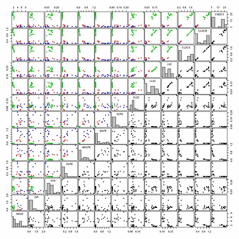
Having 13 X-ray line and/or continuum ratios, a typical data display would be the 13 choose 2 combination of scatter plots as follows. Note that the upper left panels with three colors are drawn for the classification purpose (red: AL Lac, blue: IM Peg, green:Capella) while lower right ones are discolored for the clustering analysis purpose. These scatter plots are essential to exploratory data analysis but they do not convey information efficiently with these many scatter plots. In astronomical journals, thanks to astronomers’ a priori knowledge, a fewer pairs of important variables are selected and displayed to reduce the visualization complexity dramatically. Unfortunately, I cannot select physically important variables only.
 |
I am not a well-knowledged astronomer but believe in reducing dimensionality by the research objective. The goal is set from asking questions like “what do you want from this multivariate data set?” classification (classification rule/regression model that separates three stars, Capella, AL Lac, and IM Peg), clustering (are three stars naturally clustered into three groups? Or are there different number of clusters even if they are not well visible from above scatter plots?), hypothesis testing (are they same type of stars or different?), point estimation and its confidence interval (means and their error bars), and variable selection (or dimension reduction). So far no statistical question is well defined (it can be good thing for new discoveries). Prior to any confirmatory data analysis, we’d better find a way to display this multidimensional data efficiently. I thought parallel coordinates serve the purpose well but surprisingly, it was never discussed in astronomical literature, at least it didn’t appear in ADS.

|
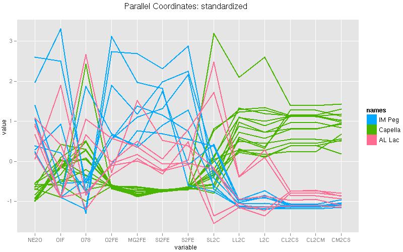
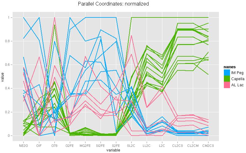
Each 13 variable was either normalized (left) or standardized (right). The parallel coordinate plot looks both simpler and more informative. Capella observations occupy relatively separable space than the other stars. It is easy to distinguish that one Capella observation is an obvious outlier to the rest which is hardly seen from scatter plots. It is clear that discriminant analysis or classical support vector machine type classification methods cannot separate AL Lac and IM Pec. Clustering based on distance measures of dissimilarity also cannot be applied in order to see a natural grouping of these two stars whereas Capella observations form its own cluster. To my opinion, parallel coordinates provide more information about multidimensional data (dim>3) in a simpler way than scatter plots of multivariate data. It naturally shows highly correlated variables within the same star observations or across all target stars. This insight from visualization is a key to devising methods of variable selection or reducing dimensionality in the data set.
Personal opinion is that not having an efficient and informative visualization tool for visualizing complex high resolution spectra in many detailed metrics, smoothed bivariate (trivariate at most) information such as hardness ratios and quantiles are utilized in displaying X-ray spectral data, instead. I’m not saying that the parallel coordinates are the ultimate answer to visualizing multivariate data but I’d like to emphasize that this method is more informative, intuitive and simple to understand the structure of relatively high dimensional data cloud.
Parallel coordinates has a long history. The earliest discussion I found was made in 1880ies. It became popular by Alfred Inselberg and gained recognition among statisticians by George Wegman (1990, Hyperdimensional Data Analysis Using Parallel Coordinates). Colorful images of the Sun, stars, galaxies, and their corona, interstellar gas, and jets are the eye catchers. I hope that data visualization tools gain equal spot lights since they summarize data and deliver lots of information. If images are well decorated cakes, then these tools from EDA are sophisticated and well baked cookies.
——————- [Added]
According to
[arxiv:0906.3979] The Golden Age of Statistical Graphics
Michael Friendly (2008)
Statistical Science, Vol. 23, No. 4, pp. 502-535
it is 1885. Not knowing French – if I knew I’d like to read Gauss’ paper immediately prior to anything – I don’t know what the reference is about.

Alfred Inselberg:
I would like to announce that
Parallel Coordinates – This book is about visualization, systematically incorporating the fantastic human pattern recognition into the problem-solving …
http://www.springer.com/math/cse/book/978-0-387-21507-5
is now available. Among others, Stephen Hawking complimented the book and recommended that his students read it.
Comments are invited
Alfred Inselberg
01-26-2010, 7:56 amupvc windows:
Hey! I know this is kinda off topic but I was wondering if you knew where I could get a captcha plugin for my comment form? I’m using the same blog platform as yours and I’m having difficulty finding one? Thanks a lot!
12-26-2010, 6:43 pmvlk:
You can use reCAPTCHA, see http://www.google.com/recaptcha and http://code.google.com/apis/recaptcha/docs/wordpress.html
01-11-2011, 4:09 am